Related styles:
-
Drudge Report - Stripped to the bones
Installs:Created: Oct 01, 2006Last Updated: Oct 04, 2006 -
Created: Jul 02, 2006Last Updated: Oct 09, 2006
-
Created: Jul 11, 2013Last Updated: Jul 31, 2013
-
Created: Sep 06, 2007Last Updated: Jan 26, 2010
-
Created: Jan 20, 2016Last Updated: Mar 03, 2016
-
Created: Oct 26, 2014Last Updated: Mar 03, 2015
-
Created: Jan 27, 2017Last Updated: Jan 27, 2017
-
Created: Oct 19, 2011Last Updated: Oct 24, 2011
-
Created: Jul 23, 2013Last Updated: Jul 24, 2013


Digg 3.0 - Stripped to the bones
Description:
UPDATED FOR DIGG'S NEW LOOK - DECEMBER 19, 2006 - SEE NOTE BELOW!
==================================
Do you want a clean, quick way to read Digg's headlines, without all the arrows, icons, and other interactive stuff cluttering up the screen?
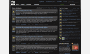
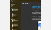
Digg 3.0 - Stripped to the bones is clean and simple -- Digg 3.0 stripped of everything except search form, headlines (fluid display), "submitted by" times, summaries, and prev/next numbers/links. Visited headlines are colored gray. And fluid design allows it to resize to your current window size.
I use this myself. It only takes a second to turn this style off, select one of Digg's sub-categories (like Technology or Linux or Videos) and then turn this style back on again.
Don't forget to also try my other style: Reddit - Stripped to the bones.
Don't forget to also try my other style: Drudge Report - Stripped to the bones.
===========================================
DON'T FORGET TO VISIT MY WEB SITE: http://www.ComputerBob.com
==========
First install FreeStyler to use this style.
If you already installed it, please, make sure this site is allowed to run JavaScript.But you can download Freestyler for other browsers and apply styles there!
Applies to:
digg.com