Related styles:
-
deviantART - Fullscreen
Installs:Created: Oct 28, 2011Last Updated: Oct 20, 2014 -
Created: Sep 03, 2011Last Updated: Apr 08, 2014
-
Created: Apr 08, 2014Last Updated: Apr 08, 2014
-
Created: Dec 20, 2015Last Updated: Oct 15, 2016
-
Created: Jul 20, 2014Last Updated: Dec 23, 2014
-
Created: Apr 01, 2015Last Updated: Jul 31, 2016
-
Created: Jun 03, 2014Last Updated: Jan 02, 2015
-
Created: Oct 12, 2016Last Updated: Apr 26, 2017
-
Created: Sep 19, 2015Last Updated: Oct 28, 2015

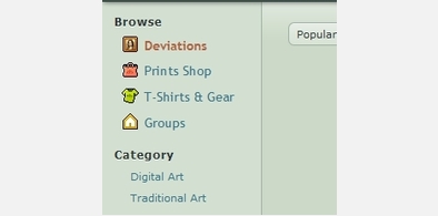


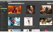
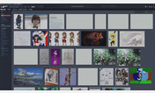
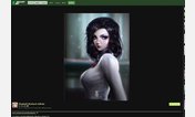

deviantART - Premium Membershit begone
Description:
Why people use this site in general is extremely confusing to me. There are sites out there that don't feel the need to endlessly advertise stupid meaningless features in exchange for a fairly substantial amount of money. Try Weasyl or something similar.
More info
-Removed giant upgrade button on top bar.
Version 1.2
-Added username change and Google Analytics. I might've missed some since I last updated but I don't use dA anymore.
Version 1.1
-Removed premium member tag from Settings page
Version 1.0
-Release
First install FreeStyler to use this style.
If you already installed it, please, make sure this site is allowed to run JavaScript.But you can download Freestyler for other browsers and apply styles there!
Applies to:
deviantart.com