Related styles:
-
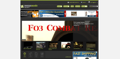
Fallout 3 Nexus fluid width, etc.
Installs:Created: Aug 24, 2011Last Updated: Aug 25, 2011 -
Created: Aug 24, 2011Last Updated: Aug 25, 2011
-
Created: Aug 24, 2011Last Updated: Aug 25, 2011
-
Created: Aug 24, 2011Last Updated: Aug 25, 2011


Witcher Nexus fluid width, etc.
Description:
I've tested it with several of the sub-pages, namely the file area, the images for the files, and the comments, and those are satisfactory. Some other areas have the header graphics looking incorrect, but it all still seems to be usable. Also, I can't add functionality that's not on the page itself, like the endorsement info or tracking info, just style what is there.
First install FreeStyler to use this style.
If you already installed it, please, make sure this site is allowed to run JavaScript.But you can download Freestyler for other browsers and apply styles there!
Applies to:
witchernexus.com