Related styles:
-
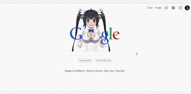
Google Hestia (Anime) version
Installs:Created: Apr 18, 2015Last Updated: Apr 22, 2015 -
Created: Jan 25, 2016Last Updated: Feb 22, 2017
-
Created: Dec 06, 2012Last Updated: Sep 08, 2015
-
Created: Sep 03, 2016Last Updated: Feb 21, 2017
-
Created: Jan 29, 2015Last Updated: Feb 24, 2016
-
Created: Jul 25, 2014Last Updated: Mar 08, 2017
-
Created: Feb 18, 2014Last Updated: Jan 28, 2016
-
Created: Feb 22, 2012Last Updated: Feb 09, 2015
-
Created: Feb 02, 2015Last Updated: Feb 24, 2016


wmorrell@userstyles deleted this style
Try Google Hestia (Anime) version instead of this deleted style.
See more styles for Google
Google Reader+ Minimal
Description:
More info
* 2011-11-01 == Initial release
* 2011-11-05 == Compacted the left-hand side a bit more, killed the red on subscription button
* 2011-11-08 == Left-hand side is narrower in addition to more compact, add border between it and content
* 2011-11-09 == Accidentally broke the 'u' and 'f' keyboard shortcuts; fix'd now
* 2011-11-29 == Late to the party with the changes adding Gmail style "Comfortable, Cozy, Compact" layouts to Reader... added changes to make Compact actually a compact layout, instead of Compact-when-compared-to-other-ridiculously-spaced-options. Not tested with Expanded View or the Comfortable/Cozy layouts. Not bothering to update screenshots, just imagine an extra gear icon in top right, and another pixel or two shaved from list entries.
First install FreeStyler to use this style.
If you already installed it, please, make sure this site is allowed to run JavaScript.But you can download Freestyler for other browsers and apply styles there!
Applies to:
http://www.google.com/reader/, https://www.google.com/reader/