Related styles:
-
facebook custom
Installs:Created: Jul 06, 2010Last Updated: Jul 07, 2010 -
Created: May 11, 2008Last Updated: May 12, 2008
-
Created: Jul 06, 2010Last Updated: Jul 07, 2010
-
Created: May 06, 2008Last Updated: Aug 25, 2010
-
Created: Aug 02, 2010Last Updated: Aug 03, 2010
-
Created: Jan 15, 2013Last Updated: Jan 16, 2013
-
Created: Jun 17, 2016Last Updated: Mar 27, 2017
-
Created: Apr 19, 2016Last Updated: Mar 17, 2017
-
Created: Feb 18, 2009Last Updated: Nov 01, 2016


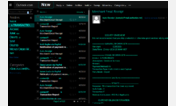
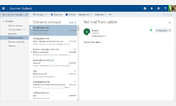

Live Mail Freshener (May 30th, 2009 Update)
Description:
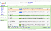
Complete Overhaul
.. row highlighting
.. shortened email list
... expanded msg list height
If you prefer the speed of the Classic view, then here's something to push the crappy classic view up a knotch.
- Ads removed
- Email listing line spacing increased
- Row highlighting
- "Mark as Unread" and "Print" button removed from listing view. (I never click these so I figured..)
- "Web" button for search removed.
- Message numbers and page numbers bar removed. There is another one on the bottom. You only need one..
- a few other small things..
I'm not a pro scripter so there are a few things I wanted to do but couldn't and well, I really just don't have time. Exams are coming up soon.
- The status bar flashes like crazy with the links. It'd be nice if anyone could do a greasemonkey script and get rid of that.
- The reply icons don't have transparent backgrounds. Not severe at all. But some people may find it annoying.
[Edited]: Up
First install FreeStyler to use this style.
If you already installed it, please, make sure this site is allowed to run JavaScript.But you can download Freestyler for other browsers and apply styles there!
Applies to:
live.com