Related styles:
-
animenewsnetwork.com - cleaner
Installs:Created: Jul 31, 2006Last Updated: Sep 26, 2016 -
Created: Sep 25, 2006Last Updated: Sep 10, 2016
-
Created: Mar 01, 2009Last Updated: Jan 12, 2016
-
Created: Jul 01, 2008Last Updated: Sep 09, 2009
-
Created: Oct 29, 2009Last Updated: Sep 02, 2013
-
Created: Sep 20, 2008Last Updated: Sep 23, 2008
-
Created: Jul 27, 2011Last Updated: Jan 03, 2013
-
Created: Mar 15, 2016Last Updated: Mar 15, 2016
-
Created: May 29, 2008Last Updated: May 30, 2008

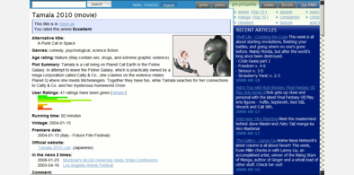
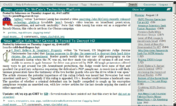

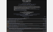

ChoGGi@userstyles deleted this style
Try TokyoTosho - Dark instead of this deleted style.
See more styles for Tokyotosho
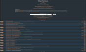
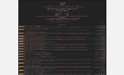
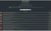
tokyotosho - cleaner
Description:
Update:
misc fixes x2
misc fixes
fix for top searches
fix for nav buttons getting blocked on low res
the first link wasnt clickable
made search bar a bit shorter
fix for search page
hide red NEW text next to search button
fixed a problem with top previous button
changed top area
tt added some stuff to search area and messed up the alignment
more categories were added so i added a max-width to that area (it was blocking the option links)
First install FreeStyler to use this style.
If you already installed it, please, make sure this site is allowed to run JavaScript.But you can download Freestyler for other browsers and apply styles there!
Applies to:
tokyotosho.com, tokyotosho.info, http://www.tokyotosho.com/settings.php, http://tokyotosho.com/settings.php... More »