
Related styles:
-
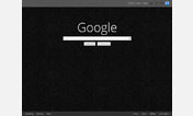
G+ Ultimate
Installs:Created: Dec 14, 2011Last Updated: Dec 22, 2011 -
 Created: Dec 14, 2011Last Updated: Dec 15, 2011
 -
 Created: Apr 18, 2015Last Updated: Apr 22, 2015
 -
 Created: Jan 25, 2016Last Updated: Feb 22, 2017
 -
 Created: Dec 06, 2012Last Updated: Sep 08, 2015
 -
 Created: Sep 03, 2016Last Updated: Feb 21, 2017
 -
 Created: Jan 29, 2015Last Updated: Feb 24, 2016
 -
 Created: Jul 25, 2014Last Updated: Mar 08, 2017
 -
 Created: Feb 18, 2014Last Updated: Jan 28, 2016

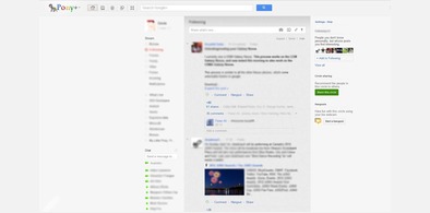
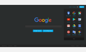
Minibar for Google+
Description:
More info
Features
-------------------------Minibar for G+ Changelog
-------------------------Known Issues
-------------------------Future plans
-------------------------Tested in
-------------------------
First install FreeStyler to use this style.
If you already installed it, please, make sure this site is allowed to run JavaScript.But you can download Freestyler for other browsers and apply styles there!
Applies to:
plus.google.com, https://plus.google.com