
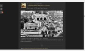
Related styles:
-

AO3 - Hide Freeform Tags
Installs:Created: Dec 13, 2012Last Updated: Dec 14, 2012 -
 Created: Jan 11, 2017Last Updated: Jan 12, 2017
 -
 Created: Sep 02, 2014Last Updated: Sep 05, 2014
 -
 Created: Jul 09, 2010Last Updated: Aug 08, 2015
 -
 Created: Sep 13, 2016Last Updated: Oct 12, 2016
 -
 Created: Nov 11, 2015Last Updated: Jan 28, 2016
 -
 Created: Sep 10, 2014Last Updated: Sep 10, 2014
 -
 Created: Apr 11, 2017Last Updated: Apr 11, 2017
 -
 Created: Jul 08, 2011Last Updated: Jul 11, 2011

Livejournal Release 88 Tweaks
Description:
Fixed to work w/ Release 89. Move subject line back to header, option for keywords-only userpic selection, changed font and font sizes, margin, comment header colors, etc.
Browsers: Chrome 10+, Firefox 4+, Safari 5.1+, Opera 11.10+
More info
(01/05) I made a userscript! http://disprove.livejournal.com/129545.html
Also recommended: http://soph.livejournal.com/227512.html
Updates!
[Sorry for the sporadic nature of updates--I'm just playing around with this stuff.]
version 2.5.4 - styled text saying "Loading..." to look better, some alignment fixes again, changed line-height of comment textarea
version 2.5.3
- changed font in textarea from Arial to Verdana
- made it so that when you click anywhere in the row to the right of the checkbox, the collapsed comment will be checkmarked
- removed the white border/box when hovering over a page number
- fixed some nitpicky text alignment issues
(02/24) version 2.5.2
- fixed to work with Release 89. Sorry I'm late, I had no internet for the last couple of days. The following are the things that changed:
- added space after hyphen before timestap in collapsed comment
- the months in the timestamp have been changed from numerals to words so to accomodate I made the minimum width of comments wider
- fixed new comment indicator alignment
- made Reply and Expand smaller
- fixed subject field indention (also see version 0.2 of Livejournal - Show Subject Field)
- moved Spell Check to the left with the other Rich Text buttons
- fixed the userpic selection box to work with changed class
version 2.5.1 - something looked a teensy bit odd with the checkboxes in Firefox. Fixed.
version 2.5 - And we're good to go on Opera! Please note, however, that the changes also mean that Safari users will now have one more button to click in order to complete installation. http://mintyapple.livejournal.com/785966.html#cutid2
version 2.4.7 - Changed the minimum width of the comments again, since LJ has now added a space in the edit timestamp.
version 2.4.6 - Fixed a problem some Flexible Squares layouts were having with disappearing footers.
version 2.4.5 - So I recently found out that this style actually works in Safari. Awesome! But there was a dotted line showing up out of nowhere in the keywords-only userpic selection box when using that particular browser, so I had to fix that.
version 2.4.4 - I forgot to color in the container of the post entry buttons (next/previous entry, mem+, edit, share, track) to match the comment headers. Fixed now. Also made the text in screened comments even darker so they can be more readable.
version 2.4.3 - The color of that arrow above the comment pages number has been annoying me for the longest time, but for the life of me, I could just not figure out how to change it--until now. I've already changed the color of the surrounding blue before, but I've always been stumped by that little arrow. *feels dumb* Anyway, I've made it so now it'll match the color of what you choose the comment header to be.
version 2.4.2
- Ahahaha, I noticed that I made some stupid errors that were mistakenly affecting custom comment pages. Only Chrome users would've been affected. The subject field was being moved to the right when that behaviour should've been occuring only in default comment pages. Should be fixed now! Please update accordingly.
version 2.4.1
- adjusted subject lines placement a very teensy bit
- changed a couple of things for the IP Address
- added "Logged in as:"
- fixed min-width for squished comments in Firefox
- fixed fonts and sizes in ?replyto= pages
- added some stuff to make room for the Livejournal - Show Subject Field script (it's okay if you don't want to use that though)
version 2.4
- italicised Anonymous
- added a hyphen between author and timestamp in a collapsed comment
- set bigger minimum width of a comment so comment header details (particularly those w/ an edit timestap) won't act all weird when comment is squished to the right (this is also more convenient for reading comments in long nested threads since LJ no longer actually lets you view only a parent comment along with replies to it and instead includes connected collapsed comments preceding it)
- fixed padding of collapsed comment so wrapping of its background color looks better when hovered on and/or selected
- fixed checkbox alignment
- made spaces between root comments bigger
version 2.3.1 - because I am terribly anal, I adjusted a few more things inside the Insert Photo|Video pop-ups and the "search keywords" input fields
version 2.3
- fixed alignment of new comment indicator in Chrome
- made the timestamp saying if and when a comment was edited more noticeable
- made shadow behind keywords-only userpic selection box a teensy bit heavier
- darkened text color of screened, frozen and spam comments to make it look more readable
- fixed color of collapsed screened, frozen and spam comments
- changed background color default to White (you can still pick Very Light Grey of course)
- also changed a few things in the Insert Link|Photo|Video pop-ups
version 2.2.2 - very minor color fix for Manage Userpics link
version 2.2.1 - set subject to overflow with ellipsis instead of going over the userhead/name below it when subject is too long and/or comment is squished to a narrow column
version 2.2 - made the container of the list of userpic keywords longer
version 2.1 - adjusted blue color around Post A New Comment
version 2.0
- added option to SELECT USERPIC WITH KEYWORDS only
- cleaned up the box containing userpic icons and keywords
- removed gradient at the top of comment section and around comment text input area
- fixed background color of collapsed comment when choosing "none", a few other nitpick-y stuff
version 1.3 - fixed comment header color for screened, selected, and frozen comments
version 1.2 - altered a few font sizes
version 1.1 - made the left margin of the comments section slightly larger
* * *
Features:
- choose whether to SELECT USERPIC via KEYWORDS ONLY or with your icons on display
- option to put SUBJECT LINE in comment header (and by this I mean that while I can't make Livejournal offer you to put a subject line via the default comment pages, old comments and new ones made via Preview or other comment style pages with subject lines will show them in the header) ETA: Mwahaha, turns out I *can* make LJ do that exactly. See http://disprove.livejournal.com/129545.html for details!
- choice between Blue (#ACE) and Light Blue (#BDF) (colors both used before in LJ's previous default comment pages) for comment headers
- optional background color when you hover over a collapsed comment
- choose either grey (#F9F9F9) or white as background color
- changed font and font sizes
- moved margins in post and comments
- keep buttons in comment headers and expand and check in a collapsed comment always visible
- removes that fugly blue border around add comment button (and preview if you have it)
- little nitpick-y things I won't bore you with
(12/27) BTW if some of the comments in the code look suspiciously similar to the one in Stuntpilot's LJ Easier Read, that would be http://stuntpilot99.livejournal.com/93240.html?thread=356664#t356664 I thought up a few more tweaks, but I figured I ought to stop being lazy and quit bothering the guy to add more of my code and just upload my own. So here this is!
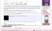
First install FreeStyler to use this style.
If you already installed it, please, make sure this site is allowed to run JavaScript.But you can download Freestyler for other browsers and apply styles there!
Applies to:
livejournal.com