Related styles:
-
OneLook.com - Grey-ish
Installs:Created: Apr 10, 2012Last Updated: May 06, 2012 -
Created: May 01, 2011Last Updated: May 11, 2015
-
Created: Dec 22, 2009Last Updated: May 06, 2015
-
Created: Jun 26, 2012Last Updated: Nov 06, 2015
-
Created: Apr 01, 2011Last Updated: Sep 30, 2014
-
Created: Feb 12, 2010Last Updated: Nov 03, 2016
-
Created: Sep 07, 2010Last Updated: Jan 20, 2017
-
Created: May 15, 2013Last Updated: Nov 03, 2016
-
Created: Dec 04, 2012Last Updated: Feb 04, 2016


OneLook.com - Dark
Description:
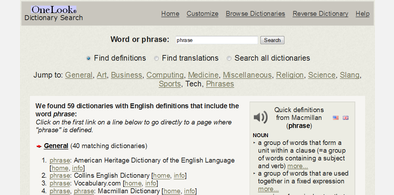
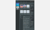
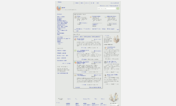
Removes adverts too.
More info
- Fixed front page logo.
- Removed smaller logo that appears after searching.
- Code formatting.
2013-09-12- Replaced black logo with off-white ones.
2013-02-20- Added webkit gradient (for Chrome)
2012-05-06- Corrected un-centered "Jump To:" text.
2012-02-25- Changed color of header/footer links to something less glaring.
=====If the link color is bothering you, which it has for me since I published the style, then look for a:link in the code and change the color value.
=====
1. There's hardly any classes or ID's to help select specific content. The code is somewhat generic.
2. The autocomplete list has alignment issues, something that is dynamically controlled by Javascript.
3. There's a commented piece of code you can edit to change the overall width and font size of pages - edit to your preference. Remove the underlined parts to uncomment/enable.
/* === Formatting change === */ /* body { width:95% !important; font-size: 1em !important; max-width: 1200px !important; margin-left: auto !important; margin-right: auto !important;} */First install FreeStyler to use this style.
If you already installed it, please, make sure this site is allowed to run JavaScript.But you can download Freestyler for other browsers and apply styles there!
Applies to:
onelook.com