Related styles:
-
Created: Apr 27, 2012Last Updated: Apr 29, 2012
-
Created: Sep 12, 2009Last Updated: Sep 13, 2009
-
Created: Jan 07, 2012Last Updated: Jan 08, 2012
-
Created: Apr 06, 2011Last Updated: Apr 07, 2011
-
Created: Feb 18, 2012Last Updated: Jun 05, 2012
-
Created: Nov 29, 2014Last Updated: Nov 29, 2014
-
Created: Jul 07, 2009Last Updated: Jul 08, 2009


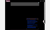
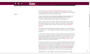
Slate Slideshow - Larger Description Area
Description:
More info
I've done what I can to describe the changes I made with comments, so others can tweak settings to match their needs. Feel free to repost your own versions with other colors, sizes, etc. since I'm sure mine won't be perfect for everyone.
First install FreeStyler to use this style.
If you already installed it, please, make sure this site is allowed to run JavaScript.But you can download Freestyler for other browsers and apply styles there!
Applies to:
http://www.slate.com/slideshows/