Related styles:
-
thefreedictionary dark
Installs:Created: Oct 28, 2011Last Updated: Nov 28, 2011 -
Created: Dec 28, 2011Last Updated: Dec 29, 2011
-
Created: Mar 18, 2013Last Updated: Apr 02, 2013
-
Created: Feb 19, 2016Last Updated: Feb 19, 2016
-
Created: May 01, 2007Last Updated: Apr 25, 2008


makondo@userstyles deleted this style because of "While this style will no longer show in the site search, it will be updated as needed."
Try thefreedictionary - cleanup (alternative version) instead of this deleted style.
See more styles for Thefreedictionary
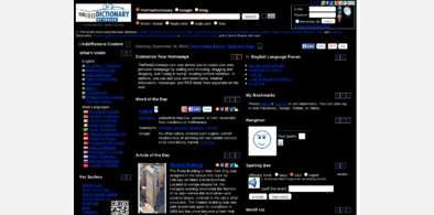
thefreedictionary.com in reverse
Description:
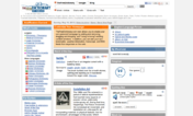
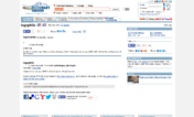
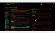
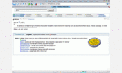
Firefox only, Vista. Works, see the pic.
This is a very simple style, nothing fancy. I don't use the site often but when i do, i really get annoyed and this style makes the site at least bearable. Well commented, change the colors, make it yours. If you need help with that, start a new discussion and i will help (no rating needed in this case).
IMPORTANT! The site has 'dynamically' generated ads, i can't remove them all (ABP removes them but leaves placeholders). I removed as much crap as i could. Also, the site is a pain to style. As i said, i don't visit it often and if i will not see changes, let me know (again, no ratings needed in this case).
More info
09/15 - touchups
First install FreeStyler to use this style.
If you already installed it, please, make sure this site is allowed to run JavaScript.But you can download Freestyler for other browsers and apply styles there!
Applies to:
thefreedictionary.com