Related styles:
-
Created: Apr 24, 2013Last Updated: Aug 29, 2015
-
Created: Apr 19, 2013Last Updated: Aug 29, 2015
-
Created: Apr 24, 2013Last Updated: May 16, 2016
-
Created: Apr 02, 2014Last Updated: Apr 02, 2014
-
Created: Feb 18, 2017Last Updated: Feb 18, 2017
-
Created: Jan 02, 2011Last Updated: Feb 11, 2016
-
Created: Jun 04, 2016Last Updated: Jun 04, 2016
-
Created: Jan 02, 2011Last Updated: Jun 21, 2015
-
Created: Aug 20, 2010Last Updated: Jan 02, 2011

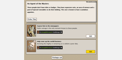

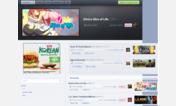



Fallen London
Description:
Updated to remove the blue Feedback button. It got in the way on Android.
Another update to decrease size of Dangerous and Persuasive stats to make them fit on one line.
More info
2014-10-04: The black nav bar at the top has been annoying me for years. I've hidden it so it will only show if you hover your mouse over where it used to be. Easily disabled should you wish so. It even works on touchscreens though I admit it's finicky. Logout and Buy Nex are still available on other parts of the screen so you hardly need the menu anyway.
2013-11-23: I've removed the 'Who else is here?' box; delete sharedContentFeed from the css if you want it back. Read this post (http://community.failbettergames.com/topic5766-who-else-is-here.aspx) for more information on it.
First install FreeStyler to use this style.
If you already installed it, please, make sure this site is allowed to run JavaScript.But you can download Freestyler for other browsers and apply styles there!
Applies to:
fallenlondon.storynexus.com