Related styles:
-
theync.com – no clutter
Installs:Created: Aug 17, 2009Last Updated: Jun 02, 2010 -
Created: Sep 21, 2008Last Updated: Sep 23, 2008
-
Created: Dec 20, 2008Last Updated: Dec 21, 2008
-
Created: Feb 27, 2009Last Updated: Aug 09, 2009
-
Created: Jul 22, 2009Last Updated: Jul 24, 2009
-
Created: Aug 12, 2009Last Updated: Aug 13, 2009
-
Created: Sep 20, 2008Last Updated: Sep 21, 2008
-
Created: Aug 28, 2009Last Updated: Feb 22, 2010
-
Created: Feb 20, 2010Last Updated: Mar 23, 2010




gimpusers.de - Design ohne NEU-Spalte
Description:
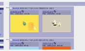
So i removed it and gave the content more space
*WOAH!!!!* Can’t upload images here (too “big”, frong file type, over and over again) so i decided to upload the images at another hoster!
Before: http://img67.imageshack.us/my.php?image=200809151809291072x743spf5.png
After: http://img395.imageshack.us/my.php?image=200809151809171069x742spw3.png
First install FreeStyler to use this style.
If you already installed it, please, make sure this site is allowed to run JavaScript.But you can download Freestyler for other browsers and apply styles there!
Applies to:
www.gimpusers.de