Related styles:
-
Most Emailed list
Installs:Created: Nov 24, 2008Last Updated: Nov 26, 2008 -
Created: Dec 09, 2009Last Updated: Dec 18, 2009
-
Created: Aug 28, 2008Last Updated: Aug 29, 2008
-
Created: Aug 07, 2008Last Updated: Aug 08, 2008
-
Created: Sep 12, 2008Last Updated: Sep 13, 2008
-
Created: Aug 13, 2008Last Updated: Aug 14, 2008
-
Created: Jan 16, 2012Last Updated: Jan 17, 2012
-
Created: Sep 16, 2008Last Updated: Sep 17, 2008
-
Created: Oct 03, 2013Last Updated: Nov 08, 2013

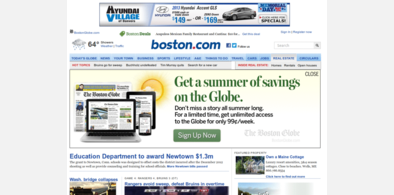
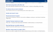


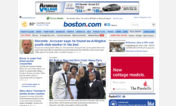
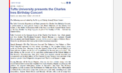

typography v2C GOLD candidate UPDATE TITO
Description:
• Normalized h3.breaking so it does not become too big
• Adjusted line-height on h3.sectionHeader
• Made subsection heads turn orange on hover
• Removed lines from ads since it created some problems and wasn't specifically typography related
• Made the 4px dotted changes apply to everything *except* blogs
• Removed spacing above from section links in the classified widget
• h2s are 24px (please check that this is ok in on PCs, I suspect it's all right)
First install FreeStyler to use this style.
If you already installed it, please, make sure this site is allowed to run JavaScript.But you can download Freestyler for other browsers and apply styles there!
Applies to:
boston.com