Related styles:
-
Created: Jan 07, 2013Last Updated: Jul 07, 2013
-
Created: Aug 15, 2013Last Updated: Aug 16, 2013
-
Created: Jan 03, 2013Last Updated: Jan 08, 2013
-
Created: May 21, 2013Last Updated: Jun 22, 2013
-
Created: Oct 22, 2013Last Updated: Oct 25, 2013
-
Created: Apr 18, 2015Last Updated: Apr 22, 2015
-
Created: Jan 25, 2016Last Updated: Feb 22, 2017
-
Created: Dec 06, 2012Last Updated: Sep 08, 2015
-
Created: Sep 03, 2016Last Updated: Feb 21, 2017


BROKEN] Google Search - Focus Grey
Description:
[11/2014] Broken, don't install.Feel free to take the code and fix it if you want to.
For the Web and Images search on Google.com.
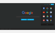
A dark grey style that allows better focus on content. Secondary interface elements are low-contrast while the content elements are more contrasted.
PLEASE NOTE: This theme is pretty broken in places and I don't intend to fix it. Google sites are a real pain to theme thanks to their obscure naming schemes. And due to my being inexperienced with CSS when I began this style, fixing it would require rewriting most parts from scratch. Also I don't use Google Search anymore anyway. Still this style works for now.
More info
- Doesn't work on regional versions of Google because many of them are stuck with old interface versions.
- Google Plus notifications thing is hidden by default because I was too lazy to fix it.
10/29/13: lazy top frame fix
5/25/13: fixed some geographical information frame
5/21/13: fixed the regexp url matching
First install FreeStyler to use this style.
If you already installed it, please, make sure this site is allowed to run JavaScript.But you can download Freestyler for other browsers and apply styles there!
Applies to:
https?://.*(encrypted|)\.google\.com(/|/webhp.*|/imghp.*|.*search.*|.*q=.*)