Related styles:
-
Delicious.com: hide top ten tags
Installs:Created: Oct 15, 2008Last Updated: Oct 16, 2008 -
Created: Feb 05, 2014Last Updated: Feb 06, 2014
-
Created: Aug 08, 2008Last Updated: Aug 09, 2008
-
Created: Aug 18, 2008Last Updated: Aug 19, 2008
-
Created: Sep 26, 2008Last Updated: Aug 07, 2010
-
Created: Sep 29, 2008Last Updated: Sep 30, 2008
-
Created: Oct 18, 2008Last Updated: Oct 19, 2008
-
Created: Mar 05, 2010Last Updated: Aug 21, 2010
-
Created: Nov 02, 2008Last Updated: Nov 03, 2008



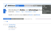

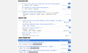

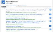

Scannably Delicious
Description:
Doesn't break anything on the other pages, but they could probably be a little nicer; let me know if you have suggestions!
First install FreeStyler to use this style.
If you already installed it, please, make sure this site is allowed to run JavaScript.But you can download Freestyler for other browsers and apply styles there!
Applies to:
delicious.com