Related styles:
-
Basilmarket LITE Forums
Installs:Created: Nov 03, 2008Last Updated: Nov 06, 2008 -
Created: Nov 03, 2008Last Updated: Nov 06, 2008
-
Created: Oct 05, 2008Last Updated: Feb 25, 2009
-
Created: Oct 06, 2008Last Updated: Oct 08, 2008
-
Created: Oct 08, 2008Last Updated: Oct 09, 2008
-
Created: Oct 12, 2008Last Updated: Oct 24, 2008
-
Created: Oct 21, 2008Last Updated: Oct 23, 2008
-
Created: Oct 26, 2008Last Updated: Oct 27, 2008
-
Created: Oct 21, 2008Last Updated: Oct 22, 2008




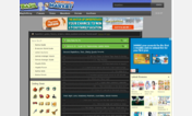


Basilmarket LITE Testing Theme
Description:
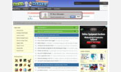
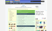
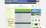
Some details...The newer design will still move the Menu Bar up behind the logo. The old design had to use a lot of codes that were messing up my head to move all the buttons up, and it jumps around when I hover over the buttons. Plus I couldn't find a way for Sub Menus to appear, one of the reasons for my Mental Breakdown. But this way, I can keep the Sub Menus and put them in a pretty cool way. This new design is even more space efficiant than the old one.
Ok, the entire theme's Head and Sub Menu is done (@_@). This afternoon I will code the GUI since theres no school.
First install FreeStyler to use this style.
If you already installed it, please, make sure this site is allowed to run JavaScript.But you can download Freestyler for other browsers and apply styles there!
Applies to:
basilmarket.com