Related styles:
-
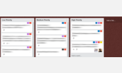
Trello - Monospace input fields
Installs:Created: Dec 12, 2016Last Updated: Dec 12, 2016 -
Created: Nov 28, 2016Last Updated: Nov 28, 2016
-
Created: Nov 28, 2016Last Updated: Nov 28, 2016
-
Created: Apr 11, 2016Last Updated: Apr 17, 2017
-
Created: Jul 27, 2014Last Updated: Mar 21, 2017
-
Created: Apr 22, 2011Last Updated: Oct 03, 2013
-
Created: Nov 22, 2011Last Updated: May 11, 2013
-
Created: Mar 19, 2013Last Updated: Aug 09, 2014
-
Created: Aug 12, 2013Last Updated: Oct 08, 2013


Todoist restyled
Description:
Mainly:
- Bigger priority indicator,
- Easier to spot labels,
- Task count in project/tag list shown as a badge
More info
2015-04-26: Hide "Add task button" when you edit a task, styled the "Add new task" as a blue button
2015-01-25: Update (label appearance, fold/unfold arrow positionning)
2014-10-10: Initial release
First install FreeStyler to use this style.
If you already installed it, please, make sure this site is allowed to run JavaScript.But you can download Freestyler for other browsers and apply styles there!
Applies to:
todoist.com