Related styles:
-
Smaller Netvibes
Installs:Created: Aug 20, 2015Last Updated: Aug 24, 2016 -
Created: Nov 29, 2014Last Updated: Oct 05, 2016
-
Created: Oct 31, 2016Last Updated: Oct 31, 2016
-
Created: Apr 10, 2015Last Updated: May 02, 2015
-
Created: Oct 15, 2017Last Updated: Apr 28, 2019
-
Created: Jan 15, 2014Last Updated: Dec 19, 2016
-
Created: Oct 29, 2016Last Updated: Dec 24, 2016
-
Created: Jul 15, 2012Last Updated: Apr 14, 2014
-
Created: Oct 31, 2008Last Updated: Nov 02, 2008



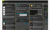


My Netvibes display - Save space and Read better
Description:
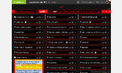
- Moves all the settings in the top right corner
- Moves the MP3 player in the top right corner
- Doesn't display the annoying red dot and other "useless" information (no share, no footer, no redundant setting, no analysis button, ...)
- Links already read are almost invisible to better see the new ones
- More space on the main page (smaller add button, smaller header, smaller tabs, smaller spaces between columns,...)
- Improvement of the reading widget (more space)
More info
First install FreeStyler to use this style.
If you already installed it, please, make sure this site is allowed to run JavaScript.But you can download Freestyler for other browsers and apply styles there!
Applies to:
http://www.netvibes.com/privatepage/