Related styles:
-
Created: Nov 22, 2013Last Updated: Apr 02, 2015
-
Created: Nov 22, 2013Last Updated: May 01, 2014
-
Created: Feb 21, 2012Last Updated: Nov 01, 2014
-
Created: Mar 20, 2017Last Updated: Mar 20, 2017
-
Created: Aug 25, 2014Last Updated: Mar 10, 2017
-
Created: Mar 20, 2014Last Updated: Mar 19, 2014
-
Created: Nov 27, 2015Last Updated: Jun 09, 2016
-
Created: Feb 14, 2017Last Updated: Feb 15, 2017
-
Created: Jan 14, 2015Last Updated: Feb 21, 2017


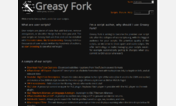

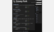


Greasy Fork Hitchhiker revived
Description:
More info
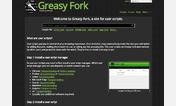
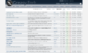
- Dark style
- Looks a lot better than the original site
- Includes support for the forum
- Always uses the entire available space (no centering!)
- Tested with Firefox and Chromium
Known issues:First install FreeStyler to use this style.
If you already installed it, please, make sure this site is allowed to run JavaScript.But you can download Freestyler for other browsers and apply styles there!
Applies to:
greasyfork.org