Related styles:
-
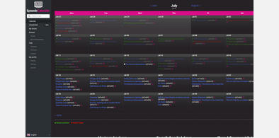
EpisodeCalendar Dark
Installs:Created: Jan 12, 2015Last Updated: Jul 17, 2016 -
 Created: Feb 27, 2016Last Updated: Apr 17, 2017

WARNING: This webware is not functioning properly. Please enable javascript in your browser and try again.

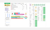
CRON-O-Meter Dark (cronometer)
Description:
I'm a CSS-noob so this stylesheet is probably everything but optimal, but it works for what I consider most important.
That said, I haven't noticed any slowing down because of this stylesheet.
Recently there was a http://i.imgur.com/VLw98N6.png added, which I don't like. You can choose to either hide it, or show it.
Along with this update the previous, more intuitive system was hidden by default. To restore it click the cogwheel on the top-right of the http://i.imgur.com/K8RCZlB.png. Now check Show Full Macronutrient Breakdown.
For suggestions, questions or anything else you can contact me at zarnaikstandard@gmail.com.
More info
2015-02-09: Modified to work with the changes of the cronometer HTML.
First install FreeStyler to use this style.
If you already installed it, please, make sure this site is allowed to run JavaScript.But you can download Freestyler for other browsers and apply styles there!
Applies to:
cronometer.com