Related styles:
-
NightShift - eye care
Installs:Created: May 24, 2009Last Updated: Jun 13, 2012 -
Created: Sep 11, 2010Last Updated: Feb 21, 2013
-
Created: Sep 11, 2010Last Updated: Dec 23, 2014
-
Created: Jan 02, 2009Last Updated: Jan 15, 2013
-
Created: Jan 18, 2009Last Updated: Dec 25, 2012
-
Created: Jun 15, 2013Last Updated: Dec 09, 2014
-
Created: Jun 22, 2012Last Updated: Jul 04, 2012
-
Created: Oct 04, 2010Last Updated: Jul 09, 2013
-
Created: Jan 02, 2009Last Updated: May 05, 2013

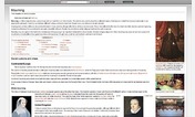


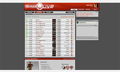
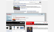

vetinari@userstyles deleted this style because of "outdated ... too many daily changes on YT "
Try Youtube Umbra instead of this deleted style.
See more styles for Youtube
aBYTE: another Black YouTube Embodiment
Description:
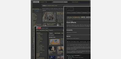
makes YouTube easy on the eyes and less dazzling;
hides all (well, most) adds & 'click me/viewme plzs' etc.;
includes all images used by the style (no image/content webrequests);
More info
UPDATE: 12.03.2011:reworked button css ...color,gfx etc. (should not be affected by changes to the YT mastersprite- gfx - any more)
______________________________________________
UPDATE: 01.03.2011:new (YT) buttons & some minor tweaks due to changes on YT
UPDATE: 21.09.2010:adapted (&optimized) this style to the current(2010) YT - Layout;
update:23&24.09.2010:minor changes to some buttons (ie. YT changed addtolist&sharing button)
update:28.01.2010:comment text-color issue- fixed & some minor adjustments due to 'new YT layout' ;-)
update:01.01.2010:completly reworked the style (more than 50% of code is new) & got rid off all the obsolete stuff (20% less code);
- the overall appearance nearly hasn't changed (only very few differences: ie. menu-highligntning, 3%-4% darker grey).
First install FreeStyler to use this style.
If you already installed it, please, make sure this site is allowed to run JavaScript.But you can download Freestyler for other browsers and apply styles there!
Applies to:
youtube.com