Related styles:
-
FT.com - white background
Installs:Created: Oct 27, 2011Last Updated: Mar 02, 2012 -
Created: Feb 27, 2017Last Updated: Feb 27, 2017
-
Created: Jan 26, 2009Last Updated: Jan 27, 2009
-
Created: Sep 19, 2016Last Updated: Sep 27, 2016
-
Created: Nov 14, 2011Last Updated: Nov 15, 2011
-
Created: Jun 30, 2016Last Updated: Jun 30, 2016
-
Created: Mar 28, 2011Last Updated: Mar 30, 2011
-
Created: Nov 16, 2008Last Updated: Nov 17, 2008
-
Created: Jun 25, 2006Last Updated: Jun 26, 2006


ft.com clean & shrink
Description:
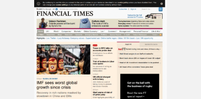
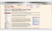
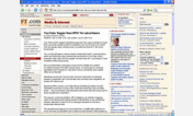
Sorry , the only "after" I have is a 210kb jpeg, but I can assure you it at least presents more information on a page than previously. Give it a shot see how it works for you. Fell free to tweak, let me know and I'll test it and update it if I like it, or just post your own version regardless :)
First install FreeStyler to use this style.
If you already installed it, please, make sure this site is allowed to run JavaScript.But you can download Freestyler for other browsers and apply styles there!
Applies to:
ft.com