Related styles:
-
ft.com clean & shrink
Installs:Created: Feb 09, 2009Last Updated: Feb 10, 2009 -
Created: Oct 27, 2011Last Updated: Mar 02, 2012
-
Created: Feb 27, 2017Last Updated: Feb 27, 2017
-
Created: Jan 26, 2009Last Updated: Jan 27, 2009
-
Created: Nov 14, 2011Last Updated: Nov 15, 2011
-
Created: Jun 30, 2016Last Updated: Jun 30, 2016
-
Created: Sep 19, 2016Last Updated: Sep 27, 2016
-
Created: Nov 16, 2008Last Updated: Nov 17, 2008
-
Created: Jun 25, 2006Last Updated: Jun 26, 2006


FT.com - Article Page Stylist
Description:
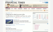
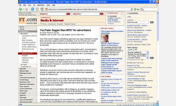
The texts' sizes in the original design is too small, making my eyes feel strain while reading them displayed on white background. So I made this to improve the readability and as well removed some useless contents located on the right-hand side of each article.
First install FreeStyler to use this style.
If you already installed it, please, make sure this site is allowed to run JavaScript.But you can download Freestyler for other browsers and apply styles there!
Applies to:
http://www.ft.com/cms/s/, http://ft.com/cms/s/