Related styles:
-
Vaunt Dark for Furaffinity
Installs:Created: Jul 29, 2013Last Updated: Apr 18, 2017 -
Created: Apr 02, 2016Last Updated: Sep 05, 2016
-
Created: Jan 18, 2016Last Updated: Jan 18, 2016
-
Created: Jul 12, 2013Last Updated: Sep 26, 2013
-
Created: Jul 26, 2014Last Updated: Jul 26, 2014
-
Created: Jan 18, 2016Last Updated: Jan 18, 2016
-
Created: Feb 26, 2014Last Updated: Sep 16, 2015
-
Created: Mar 20, 2014Last Updated: Sep 10, 2015
-
Created: Dec 20, 2015Last Updated: Oct 15, 2016

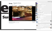
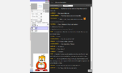
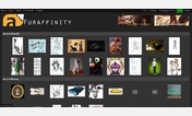

ponybells@userstyles deleted this style because of "Sliverbore's off on hiatus until I feel the need to mess with beta tag soup. We'll see."
Try Vaunt Dark for Furaffinity instead of this deleted style.
See more styles for Furaffinity
Sliverbore for Furaffinity
Description:
Works ONLY with the new Beta style.
Sliverbore is NOT replacing Vaunt Dark at the classic theme level!
More info
Version Name: "Rotate Up For What"
Mini-changelog:
A preliminary revision of how the design should work in my eyes.
Unfortunately, two ads fall victim to poor placement and a really strange inability to be positioned elsepage in CSS, and are subsequently hidden. Sorry.
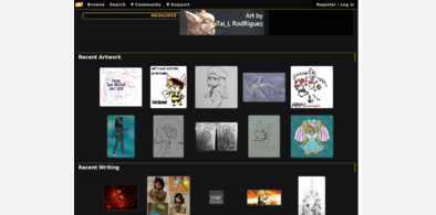
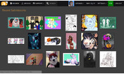
The position of the user profile and profile image has been rotated upward into the display cycle, and the recent submissions were properly squished off to the right side.
First install FreeStyler to use this style.
If you already installed it, please, make sure this site is allowed to run JavaScript.But you can download Freestyler for other browsers and apply styles there!
Applies to:
www.furaffinity.net