Related styles:
-
Fatbunny Creams for Inkbunny
Installs:Created: Apr 02, 2016Last Updated: Sep 05, 2016 -
Created: Jul 26, 2014Last Updated: Jul 26, 2014
-
Created: Jul 12, 2013Last Updated: Sep 26, 2013
-
Created: Jan 18, 2016Last Updated: Jan 18, 2016
-
Created: Jan 18, 2016Last Updated: Jan 18, 2016
-
Created: Feb 26, 2014Last Updated: Sep 16, 2015
-
Created: Mar 20, 2014Last Updated: Sep 10, 2015
-
Created: Dec 20, 2015Last Updated: Oct 15, 2016
-
Created: Mar 17, 2015Last Updated: Jun 13, 2016

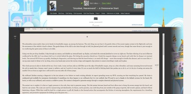
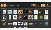
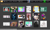
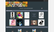

Vaunt Dark for Furaffinity
Description:
Important note: This style works properly when the basic Dark theme is selected on FurAffinity. ponybells can only do so much with fixing the spaghetti there.
DOUBLE IMPORTANT NOTE!: Vaunt Dark will NOT be rewritten to work with the new beta layout for FurAffinity. Much of what Vaunt Dark was written to fix is either fixed in the new layout, or could potentially be fixed as feedback is being given to the beta design group. Vaunt Dark will continue to focus on the Classic style.
More info
Version v17.04.18.01-FX-VTDK:
Fixed the hover menu for user names. Some recent change screwed up the z-index (the axis that determines what layer is something on), making this menu NOT work. I fixed it for my theme.
Version v17.04.01.01-FX-VTDK:
Added font size selectors for stories that actually work, because somehow I missed this.
Made keywords stand out a bit more on each entry.
Fixed the undersized news blob that appears in the upper left corner. Font size brought into compliance.
Version v17.01.26.01-FX-VTDK:
Front page fixed, as well as alignment of the projectors. Important: please consider this theme as being on life support. I'll fix things as they irritate me enough, but I don't use FA as much these days.
First install FreeStyler to use this style.
If you already installed it, please, make sure this site is allowed to run JavaScript.But you can download Freestyler for other browsers and apply styles there!
Applies to:
www.furaffinity.net