Related styles:
-
Created: Jan 21, 2015Last Updated: May 17, 2015
-
Created: Jan 30, 2015Last Updated: May 19, 2015
-
Created: Oct 03, 2014Last Updated: Feb 08, 2015
-
Created: Jul 13, 2014Last Updated: Oct 15, 2016
-
Created: Apr 12, 2015Last Updated: Apr 12, 2015
-
Created: Nov 01, 2015Last Updated: Apr 23, 2017
-
Created: Apr 06, 2016Last Updated: Dec 24, 2016
-
Created: Apr 09, 2016Last Updated: Jan 30, 2017
-
Created: Sep 01, 2016Last Updated: Apr 18, 2017





anagrammar@userstyles deleted this style because of "VK did a major overhaul and I don't feel like fixing it."
Try Старый дизайн ВК instead of this deleted style.
See more styles for Vk
VK Dark-Blue w/ Subtle Texture (Any Browser) FF35+
Description:
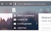
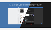
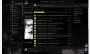
I had to compress the pics to upload, so the texture in the pics looks glitchy up close. The texture in the actual style is barely noticeable.
More info
Update 5/14 - Cleaned up the icon and bit-rate text positioning for audio areas, forced Google translated small profile pic names to split into two lines, and fixed the appearance of some other icons.
Update 5/14 - A few more fixes.
First install FreeStyler to use this style.
If you already installed it, please, make sure this site is allowed to run JavaScript.But you can download Freestyler for other browsers and apply styles there!
Applies to:
vk.com