Related styles:
-
DN Anti-Paywall
Installs:Created: Nov 23, 2016Last Updated: Nov 23, 2016 -
Created: Jul 15, 2015Last Updated: Jul 17, 2015
-
Created: Jul 15, 2015Last Updated: Jul 15, 2015
-
Created: Dec 11, 2016Last Updated: Apr 25, 2017
-
Created: May 05, 2014Last Updated: Jul 23, 2014
-
Created: Mar 12, 2014Last Updated: Jul 23, 2014
-
Created: Jan 02, 2017Last Updated: Apr 10, 2017
-
Created: Nov 07, 2008Last Updated: May 28, 2015
-
Created: Feb 28, 2016Last Updated: Feb 29, 2016


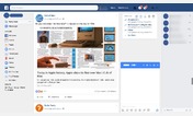
Facebook 'material design' - reader friendly
Description:
- No commenting
- No liking
- No sharing
Just get it over with and go about your day. Only exceptions are pages and groups, because like Back Street Boys famously once said - I want it that way.
More info
v.1.4 - Cleaned up login screen.
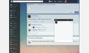
v.1.3 - Added sepia background to reduce eye strain. Work in progress - will look over some different color choices, feel free to come with suggestions.
v.1.2 - Removed post box in the news feed and in the profile. Also removed ability to comment, like and share posts.
v.1.1.1 - Restricted the left column to 700px and after that it is scrollable. Please give me feedback if it's a bad addition or if it should be tweaked/reverted.
v. 1.1 - Also removed some lists from the left column (who uses them?) and fixed it when you scroll. More fixes on the way.
First install FreeStyler to use this style.
If you already installed it, please, make sure this site is allowed to run JavaScript.But you can download Freestyler for other browsers and apply styles there!
Applies to:
www.facebook.com