Related styles:
-
Created: Apr 26, 2009Last Updated: Apr 27, 2009
-
Created: Jul 16, 2009Last Updated: May 23, 2011
-
Created: Jan 15, 2011Last Updated: Jan 16, 2011
-
Created: Oct 03, 2008Last Updated: Jan 29, 2009
-
Created: Nov 23, 2008Last Updated: Nov 25, 2008
-
Created: Jun 19, 2015Last Updated: Jun 29, 2015
-
Created: Jul 16, 2009Last Updated: Jul 17, 2009
-
Created: Apr 12, 2015Last Updated: Apr 09, 2017
-
Created: Mar 05, 2017Last Updated: Mar 06, 2017


Red: Mark visited links as read on unruly domains
Description:
To color visited links red for all web pages see http://freestyler.ws/style/13087/red-visited-mark-visited-links-red-dm (17357).
More info
Have simply incorporated "red:" bookmarklet as a style for specific domains. The bookmarklet version can be obtained
at http://www.mvps.org/dmcritchie/lessons/intro/k.html look for "red: Visited links to RED for visibility" and give the bookmarklet a keyword of "red:". The bookmarklet can be used on sites as they come up and you can easily add such sites to your style. Making no attempt to restore underscoring of links, adding red boxes around images, or changing the background with some transparency. There were a few sites that I normally view that would not allow me to change the visited link color so left them out. You could use the "ReadEasily" extension or turn off styling for such sites.
Visited and unvisited site distinction is made possible by having a browsing history. This picture shows what you need and what you must not clear -- http://img232.imageshack.us/img232/4928/clearcachew.png
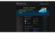
Content that could be used to make both types of links look more conventional. The hover background color change might help with an occasional link which would otherwise be blue on blue as in proposed changes to addons site which has at least one link on each page intended to show as white on blue.
a, .fl {color: #0000CC !important; text-decoration: underline !important;}
a:hover {background:white;-moz-opacity:.10;opacity:.90;}
a:visited, .fl:visited { color: #CC0000 !important }
If you don't want the tacky kindergardenish appearance of support.mozilla.com, you can add filter rules to Adblock Plus to block
"||support.mozilla.com/media/img/wiki/morehelp.nurse.png" and
"||support.mozilla.com/media/img/nurse*.png" to your "Adblock Plus" filters.
Another filter rule that can be added Adblock Plus is one to eliminate the useless footer at the bottom of support.mozilla.com pages that really slows down the pages, making the page weights very heavy and which interferes with updating and scrolling is
"support.mozilla.com###footer-contents" and
"support.mozilla.com###footer" and
"mozilla.org###sub-footer-contents" and
"mozilla.org###footer"
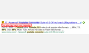
Have added reddish highlighting for Google search results with "This site may harm your computer.". Firefox itself should prevent you from accessing such sites identified by stopbadware.org as both Mozilla, Google, and several others are partners. Make sure that your Firefox Tools, Options, Security has "Block reported attack sites", which is the default, you might do the same for phishing sites as well. If you have "Customize Google" extension and choose to show web favicons, the favicon changes to a white exclamation point on a red sphere as a warning on such sites, but the favicons disappear if you are signed into Google, so this change should show when you are getting a lot of malware search hits. [this portion of code based on http://freestyler.ws/style/12660/google-compact-and-keyword-highlight (16887)]
The http://freestyler.ws/style/36934/google-highlight-harmful-site-alert (42848) is also available as a separate style.
When updates are noted for userstyles.org it only applies to an update within userstyles.org, but if you see customized (probably seen only in the old version of Stylish and depending on how you check for updates) then you had made modifications to your copy.
If you are in the habit of modifying a style, you may have added your own additional unruly sites and would want to compare code of your version as old to the new version of this style with something like "Quick Diff Online Tool" at http://www.quickdiff.com/index.php using copy and paste and choose the inline comparison.
Note on Stylish: If at any time you want to view a page as it was authored without your Stylish modifications, you can toggle Stylish ON/OFF via the Stylish toolbar/statusbar icon. The button loses color when Stylish is OFF.
Updates: since 2009-04-08
2009-05-21 include mozillazine, and several more sites, including blogs.
2009-09-07 extra highlighting for Google's warning "This site may harm your computer."
2011-01-18 background changes for support.mozilla.com & addons.mozilla.org
2011-02-27 a(anchor) in addons.mozilla.org messed up gallery review snapshots
2011-07-01 google top black bar made readable based on style-50108 */
First install FreeStyler to use this style.
If you already installed it, please, make sure this site is allowed to run JavaScript.But you can download Freestyler for other browsers and apply styles there!
Applies to:
mozilla.com, mozilla.org, forums.mozillazine.org, kb.mozillazine.org... More »