Related styles:
-
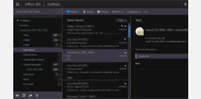
OUTLOOK 365 | DARKNESS
Installs:Created: Sep 01, 2016Last Updated: Feb 26, 2017 -
Created: Jan 10, 2016Last Updated: Sep 17, 2016
-
Created: Apr 23, 2014Last Updated: Apr 23, 2014
-
Created: Apr 01, 2015Last Updated: May 22, 2015
-
Created: Nov 20, 2015Last Updated: Jan 18, 2016
-
Created: Nov 17, 2015Last Updated: Nov 12, 2015
-
Created: Sep 04, 2015Last Updated: Sep 04, 2015
-
Created: Jul 21, 2016Last Updated: Jul 21, 2016
-
Created: Nov 17, 2015Last Updated: Dec 07, 2015




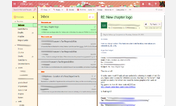

Office 365 Outlook Inbox Fix
Description:
[rant] *sigh* It's a shame that Microsoft thinks the way to fix its interfaces is to optimize /everything/ for mobile touchscreens, while PC users remain their most loyal customers. You're pushing away the only people who want to love you, Microsoft! [/rant]
More info
I might make changes to this design as I see fit. Or if Microsoft changes the DIV names and I have to redo it all.
Again, if you don't like the colors, edit the hex codes in the CSS. Feel free to edit this and re-publish the style. I don't care if you credit me. There needs to be more ways to fix this crummy interface.
First install FreeStyler to use this style.
If you already installed it, please, make sure this site is allowed to run JavaScript.But you can download Freestyler for other browsers and apply styles there!
Applies to:
outlook.office365.com, outlook.office.com