
Related styles:
-

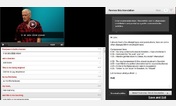
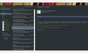
Amara translation interface 1920x1080
Installs:Created: Apr 06, 2013Last Updated: Apr 07, 2013 -
 Created: Jul 21, 2012Last Updated: Apr 07, 2013
 -
 Created: Jul 17, 2012Last Updated: Apr 07, 2013
 -
 Created: Sep 01, 2016Last Updated: Feb 26, 2017
 -
 Created: Jan 10, 2016Last Updated: Sep 17, 2016
 -
 Created: Nov 10, 2015Last Updated: Nov 10, 2015
 -
 Created: Apr 01, 2015Last Updated: May 22, 2015
 -
 Created: Nov 17, 2015Last Updated: Nov 12, 2015
 -
 Created: Sep 04, 2015Last Updated: Sep 04, 2015

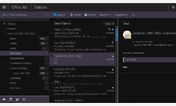
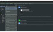
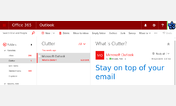
Office 365 Outlook Web Access - Tighter interface
Description:
* Tightens up the folder list 20-25
* Changes fonts and more clearly marks unread messages, more like 2010 OWA
* Tries to address the white-on-white theme so you can actually see the different panes
More info
If you see something that doesn't scale right or is off/broken please let me know, I can't guarantee I will be able to fix it but I would still be grateful for your input.
First install FreeStyler to use this style.
If you already installed it, please, make sure this site is allowed to run JavaScript.But you can download Freestyler for other browsers and apply styles there!
Applies to:
outlook.office365.com