
Related styles:
-
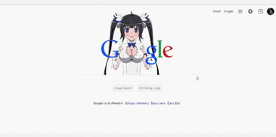
Google Hestia (Anime) version
Installs:Created: Apr 18, 2015Last Updated: Apr 22, 2015 -
 Created: Jan 25, 2016Last Updated: Feb 22, 2017
 -
 Created: Dec 06, 2012Last Updated: Sep 08, 2015
 -
 Created: Sep 03, 2016Last Updated: Feb 21, 2017
 -
 Created: Jan 29, 2015Last Updated: Feb 24, 2016
 -
 Created: Jul 25, 2014Last Updated: Mar 08, 2017
 -
 Created: Feb 18, 2014Last Updated: Jan 28, 2016
 -
 Created: Feb 22, 2012Last Updated: Feb 09, 2015
 -
 Created: Feb 02, 2015Last Updated: Feb 24, 2016

Google Music - Flat White Desktop Edition [BETA]
Description:
This theme strives to change that- by taking some design choices from Microsoft Groove's web design and putting them together with Material design.
This theme provides a much flatter experience, with smaller buttons and smaller menus so that more albums can be visible on your screen at once, focusing on content and clarity rather than beautiful box shadows.
More info
+ = feature
- = regression/bug
Version 0.1 (First Release):
+ Changed main theme colours
+ Removed box shadows
+ Created simple borders (with hover)
+ Removed Google Music's logo
+ Top and bottom menu has been made smaller
+ Buttons have been made smaller
+ Albums have been made smaller to fit more on the screen at once
+ Fixed other layouts (including New Releases and Album View)
+ Removed ugly and pixelated artist background
+ Removed border by artists, making it visually different
- Artist and album view have three buttons (share, radio and add to library) which hover on random places depending on artist and album
- Not everything has made the transition yet
First install FreeStyler to use this style.
If you already installed it, please, make sure this site is allowed to run JavaScript.But you can download Freestyler for other browsers and apply styles there!
Applies to:
https://play.google.com/music