Related styles:
-
Created: May 30, 2010Last Updated: Sep 13, 2015
-
Created: Aug 05, 2012Last Updated: Aug 06, 2012
-
Created: May 24, 2009Last Updated: Jun 13, 2012
-
Created: Feb 17, 2012Last Updated: Feb 18, 2012
-
Created: May 01, 2011Last Updated: May 11, 2015
-
Created: Sep 01, 2014Last Updated: Jan 18, 2017
-
Created: Aug 09, 2013Last Updated: Aug 10, 2013
-
Created: Feb 16, 2014Last Updated: Nov 21, 2015
-
Created: Sep 12, 2014Last Updated: Jun 05, 2015


makondo@userstyles deleted this style
Try Global dark style - changes everything to DARK instead of this deleted style.
See other styles
Text boxes & buttons - Smoked
Description:
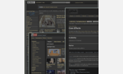
The style will work well if you visit darker sites mostly. The textboxes bg is a transparent image which means the site' color will show through slightly. If you want a permanently set color, just add it right after the word background: in this line: pre, textarea, pre:focus, textarea:focus { background: YOUR COLOR url(......)[if you need help with this, post in my thread linked below, please!]
A bigger shot is here: http://img193.imageshack.us/img193/4921/captureg.png
07/16/09 - code reverted back, seems to work better. Added shadows, slightly lighter bg for textboxes for better visibility. Remember, it's still almost transparent and might look too dark against a dark bg (which is rare in textboxes as they're usually bright white in you face).
First install FreeStyler to use this style.
If you already installed it, please, make sure this site is allowed to run JavaScript.But you can download Freestyler for other browsers and apply styles there!
Applies to:
http, https, file