
Related styles:
-
 Created: Jun 26, 2009Last Updated: Jun 27, 2009
 -
 Created: May 30, 2010Last Updated: Sep 13, 2015
 -
 Created: Aug 05, 2012Last Updated: Aug 06, 2012
 -
 Created: May 24, 2009Last Updated: Jun 13, 2012
 -
 Created: Feb 17, 2012Last Updated: Feb 18, 2012
 -
 Created: May 01, 2011Last Updated: May 11, 2015
 -
 Created: Sep 01, 2014Last Updated: Jan 18, 2017
 -
 Created: Aug 09, 2013Last Updated: Aug 10, 2013
 -
 Created: Feb 16, 2014Last Updated: Nov 21, 2015

Brent Elskan@userstyles deleted this style
Try UF SRC - Schedule Modifier Color Fix (Earthtoned) instead of this deleted style.
See other styles
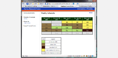
UF WebXMS - Interface Clarity & Color Corrections
Description:
The XMS color scheme, highlights, tool tips, and some other display matters, make it difficult for people to see some of the important factors. I've tried my best to make these issues less of a problem by altering things like the overall color scheme, the highlighting, button/input display and more.
One critical change that makes an immediate difference is the font size. Currently, XMS uses a font size which is not really good for people who have poor vision (like myself), so I've enlarged the font size default to 10-point, which seems to have drastically increased readability, though some pages may look strange. If you w
First install FreeStyler to use this style.
If you already installed it, please, make sure this site is allowed to run JavaScript.But you can download Freestyler for other browsers and apply styles there!
Applies to:
xms.dce.ufl.edu, https://xms.dce.ufl.edu/admin/XslTransform.aspx