Related styles:
-
Nowy mbank - wersja uspokojona
Installs:Created: Nov 10, 2014Last Updated: Jan 04, 2015 -
Created: Jun 15, 2013Last Updated: Nov 10, 2014
-
Created: Jan 29, 2015Last Updated: Jan 29, 2015
-
Created: Jul 01, 2009Last Updated: Jul 02, 2009
-
Created: Aug 06, 2010Last Updated: Aug 07, 2010
-
Created: Jan 10, 2010Last Updated: Jan 11, 2010
-
Created: Jul 10, 2009Last Updated: Jul 11, 2009
-
Created: Feb 28, 2009Last Updated: Mar 01, 2009
-
Created: Sep 24, 2013Last Updated: Sep 24, 2013

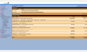

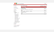

mBank - better internetbanking
Description:
It can be used for all language versions: Czech, Polish, Slovak. But it is tested only on Czech version.
What this CSS improve:
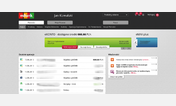
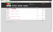
1. Add background color to even rows in tables
2. Remove redundant underlining for all action links in the tables
3. Compress height of action links in the tables to save space
4. Make delimer line between rows in table less noticeable
5. REMOVED - IT CAUSED ANOTHER PROBLEMS Make money amount field longer - in original all amount bigger than 999 999 are wrapped to second line - thanks to signy
------------------------------------------------------------------------------------------------------------
Czech description:
"mBank - better internetbanking" je styl zlepsujici vzhled mBank internetbankingu po vydani "vylepsenejho vzhledu" po 14.6.2009.
Muze byt pouzit pro vsechny jazykove verze, ale je testovan pouze s cesko
First install FreeStyler to use this style.
If you already installed it, please, make sure this site is allowed to run JavaScript.But you can download Freestyler for other browsers and apply styles there!
Applies to:
mbank.eu