Related styles:
-
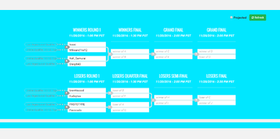
smash.gg chroma key'd brackets
Installs:Created: Nov 17, 2016Last Updated: Nov 17, 2016 -
Created: Mar 10, 2015Last Updated: Oct 20, 2016
-
Created: Aug 28, 2016Last Updated: Aug 28, 2016
-
Created: Nov 09, 2016Last Updated: Nov 09, 2016
-
Created: Oct 05, 2016Last Updated: Oct 05, 2016
-
Created: Mar 10, 2015Last Updated: Mar 10, 2015
-
Created: Sep 24, 2016Last Updated: Sep 24, 2016

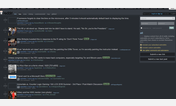
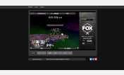
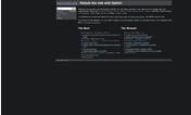


smash.gg in the dark
Description:
More info
2/4/2017-- support for the NEW pages "Shops" and "Fantasy"
1/28/2017-- - updated the style to include darkness for the NEW "Tournaments", "Results", and "Rankings" pages
- changed color scheme between "Tournaments" & "Results" to be more distinct (because orange and slightly desaturated gold is a bad scheme imo)
- other small fixes
11/18/2016-- fixed markdown table elements on event pages being too dark, fixed some problems in the player voting area
10/17/2016-- Made the Summit voting fade-in menu dark
10/12/16-- fixed some parts of the new "events" area
10/3/16-- fixed something on the summit voting page, made alerts more readable
8/27/16-- made the live stream match boxes look nice
8/19/16-- some minor fixes
8/18/16-- initial release
First install FreeStyler to use this style.
If you already installed it, please, make sure this site is allowed to run JavaScript.But you can download Freestyler for other browsers and apply styles there!
Applies to:
smash.gg