Related styles:
-
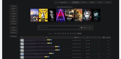
Dark and Clean Rarbg
Installs:Created: Sep 01, 2016Last Updated: Nov 27, 2016 -
Created: Sep 02, 2016Last Updated: Sep 06, 2016
-
Created: Sep 02, 2016Last Updated: Dec 12, 2016
-
Created: Sep 02, 2016Last Updated: Sep 02, 2016
-
Created: Sep 02, 2016Last Updated: Apr 13, 2017
-
Created: Jan 19, 2017Last Updated: Jan 24, 2017
-
Created: Sep 02, 2016Last Updated: Sep 02, 2016
-
Created: Sep 01, 2016Last Updated: Sep 01, 2016
-
Created: Sep 01, 2016Last Updated: Sep 01, 2016

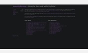
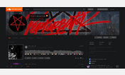
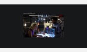
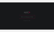

Dark and Clean Pastebin
Description:
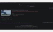
Currently all screenshots are up to date.
More info
Version 0.5
Revert profile image removal for now
Add support for error and assorted code blocks/boxes
Fix hover on public pastes
Version 0.4
More improvements to global syntax highlighting, sorry for the wait!
Better comment/ multiline comment support
Version 0.3
Improve global syntax highlighting a bit more
Add new syntax images
Version 0.2
Replaced various images, primarily on landing page.
Fixed some syntax highlighting colors.
Remove a few buttons/ badges
Version 0.1
Hide evident popups (current)
Add syntax highlighting support
Future:Create replacement images & swap with current bright images (started/ incomplete)
Replace remaining images and continue working on syntax highlighting. (started/ incomplete)
Fix user image
First install FreeStyler to use this style.
If you already installed it, please, make sure this site is allowed to run JavaScript.But you can download Freestyler for other browsers and apply styles there!
Applies to:
pastebin.com