Related styles:
-
April fools beautification
Installs:Created: Oct 27, 2016Last Updated: Jan 23, 2017 -
Created: Oct 20, 2016Last Updated: Apr 24, 2017
-
Created: Nov 18, 2016Last Updated: Mar 30, 2017
-
Created: Apr 18, 2017Last Updated: Apr 18, 2017
-
Created: Apr 20, 2013Last Updated: Jun 26, 2013
-
Created: Feb 19, 2013Last Updated: Feb 20, 2013
-
Created: May 17, 2011Last Updated: May 18, 2011
-
Created: Nov 09, 2010Last Updated: Nov 10, 2010
-
Created: Jun 23, 2009Last Updated: Jun 24, 2009


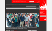
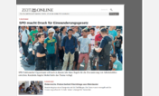
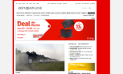
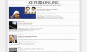

zeit.de condensed
Description:
New: Optional complete removal of comments.
More info
# Update 2017-04-12: Option to remove ZeitPlus-articles; Edited option to remove most read, most commented, most shared; Minor fixes in footer.
# Update 2017-04-07: Condensed the Liveblog a little bit.
# Update 2017-04-06: Removed footer logo and footer margin.
# Update 2017-03-17: Updated "teaser-fullwidth" image position.
# Update 2017-01-26: Updated new main teaser "teaser-classic"; Removed ads from navigation; Added more options; Updated description.
# Update 2016-12-27: Added option to remove comment section.
First install FreeStyler to use this style.
If you already installed it, please, make sure this site is allowed to run JavaScript.But you can download Freestyler for other browsers and apply styles there!
Applies to:
zeit.de