Related styles:
-
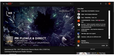
Dark Live Chat for YouTube
Installs:Created: Mar 07, 2017Last Updated: Apr 10, 2017 -
Created: Apr 21, 2017Last Updated: Apr 21, 2017
-
Created: Jan 30, 2017Last Updated: Apr 05, 2017
-
Created: May 30, 2010Last Updated: Sep 13, 2015
-
Created: Aug 05, 2012Last Updated: Aug 06, 2012
-
Created: May 24, 2009Last Updated: Jun 13, 2012
-
Created: Feb 17, 2012Last Updated: Feb 18, 2012
-
Created: May 01, 2011Last Updated: May 11, 2015
-
Created: Sep 01, 2014Last Updated: Jan 18, 2017


Description:
For Chrome users:
To watch the video on fullscreen, first click on the video, and then when it positions to the center of the screen, click the fullscreen button.
Since facebook is using React.js, which is a library that re-uses components, there are some styles that must stay default, because if I style them, on the other page that same component becomes very ugly and on the other it is ok. Therefore I can't style everything.
More info
4/18/2017
Fixed the "Search" layout on group search.
3/25/2017
Fixed broken header on Firefox. Now the style is 100% compatible on Firefox. Everything is A-ok! :)
3/24/2017
I've added a "scale" transform property when browsing pictures, so now when browsing profile or page pictures, on hover, images scale up.
3/9/2017
More animations! :D This time when browsing pictures :D
2/10/2017
Fixed some bugs. Removed the "Suggested Pages" & "Suggested Groups" section. Added transparent chat (I'll make this option to be toggled.).
1/18/2017
Added animated reactions. Yes the reactions now animate!
1/13/2017
Updated the new messages page.
1/11/2017
Totally forgot about the messages page, colored that paged too! :D
1/10/2017
Added the style to the landing page.
1/9/2017
Style still works as it should.
12/16/2016
Urgh, I think that the style is a little buggy because of the Animate.css properties. It works, but sometimes it puts the box on the left side, like slides on the left side by itself. Will look into what's causing the problem. UPDATE - It seems that this bug is only present on Chrome, on Firefox everything works just fine.
12/10/2016
Added some more shadows :D
Oh, and added a "fadeIn" effect that I've extracted from Animate.css, it looks interesting... I think o.O
12/9/2016
I've added some shadows on boxes and changed the color of the "Post" button to match the material design.
First install FreeStyler to use this style.
If you already installed it, please, make sure this site is allowed to run JavaScript.But you can download Freestyler for other browsers and apply styles there!
Applies to:
all URLs