Related styles:
-
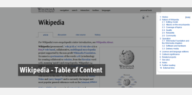
Wikipedia - Table of Content
Installs:Created: Nov 21, 2009Last Updated: Nov 22, 2009 -
Created: Apr 04, 2010Last Updated: Apr 02, 2011
-
Created: Aug 30, 2010Last Updated: Aug 31, 2010
-
Created: Aug 26, 2011Last Updated: Aug 27, 2011
-
Created: Feb 02, 2014Last Updated: Feb 02, 2014
-
Created: Nov 21, 2009Last Updated: Nov 22, 2009
-
Created: Jul 10, 2016Last Updated: Jul 10, 2016
-
Created: Dec 21, 2010Last Updated: Dec 22, 2010
-
Created: Aug 22, 2010Last Updated: Feb 25, 2011








(admin) deleted this style because of "site no longer exists."
Try Wikipedia - Table of Content instead of this deleted style.
See more styles for Google
Google Reader - Multicolumn Expanded View
Description:
To change the number of columns you NEED to change the code. The instructions are in the code. Default is 2 columns. [Note: If you're going to only use two columns, then you might want to change the code as instructed inside. That setup *might* work better, but no guarantee]
This script should play nice with others although it has not been extensively tested. If you notice anything broken please do voice out below.
Note: You may notice some of the post getting pushed down leaving whitespace after some posts. As far as I know, this is a limitation of CSS float, NOT A BUG. If anybody has information about how to fix this please do leave a message.
This script works best with http://freestyler.ws/style/11464/google-reader-image-resizer, to help with the problem of overflowing images.
First install FreeStyler to use this style.
If you already installed it, please, make sure this site is allowed to run JavaScript.But you can download Freestyler for other browsers and apply styles there!
Applies to:
http://www.google.com/reader/