Related styles:
-
Nice Firefox forms
Installs:Created: May 30, 2007Last Updated: May 31, 2007 -
Created: Aug 21, 2010Last Updated: Sep 04, 2011
-
Created: Apr 12, 2011Last Updated: Apr 13, 2011
-
Created: Feb 04, 2011Last Updated: Feb 04, 2011
-
Created: Jun 01, 2008Last Updated: Jun 02, 2008


void@userstyles deleted this style because of "No longer applicable"
Try useit.com Easier Reading instead of this deleted style.
See more styles for Useit
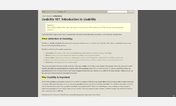
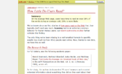
readability] useit.com
Description:
I'll be experimenting with this style as I browse through the site. If you need a previous version let me know and I'll see if I can send you the code. Comments and suggestions are welcome.
v0.1.3 (07/Feb/08)
- Added !important (darn!)
- Changed base font family, size and line-height.
v0.1.2 (30/May/07)
- Quite some changes in spacing, fonts & "effects", and a bit in colors.
v0.1.1 (28/May/07)
- Margins added (valeryxavier)
- Styled of H3 elements
- Other trivial changes/corrections.
First install FreeStyler to use this style.
If you already installed it, please, make sure this site is allowed to run JavaScript.But you can download Freestyler for other browsers and apply styles there!
Applies to:
useit.com, http://www.useit.com/, http://useit.com/, http://www.useit.com/alertbox/... More »