Related styles:
-
Created: May 30, 2010Last Updated: Sep 13, 2015
-
Created: Aug 05, 2012Last Updated: Aug 06, 2012
-
Created: May 24, 2009Last Updated: Jun 13, 2012
-
Created: Feb 17, 2012Last Updated: Feb 18, 2012
-
Created: May 01, 2011Last Updated: May 11, 2015
-
Created: Sep 01, 2014Last Updated: Jan 18, 2017
-
Created: Aug 09, 2013Last Updated: Aug 10, 2013
-
Created: Feb 16, 2014Last Updated: Nov 21, 2015
-
Created: Sep 12, 2014Last Updated: Jun 05, 2015








lordmedikit@userstyles deleted this style
Try Global dark style - changes everything to DARK instead of this deleted style.
See other styles
Slashdot Modern
Description:
Comments welcomed. I'm especially interested to know what you think of the new way I've organised the comments. I think it makes them a lot easier to follow, agree/disagree?
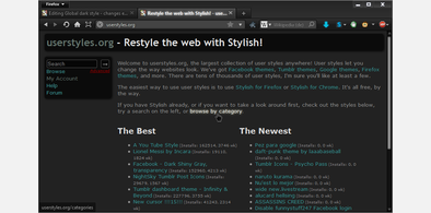
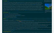
The 'before' screenshot shows the new frontpage, the 'after' screenshot shows the new way I've laid out the comments (you can right click > view image to see larger versions). Also the colours are compressed in the screenshots...
Will probably be broken when the new design come along anyway :( ...
First install FreeStyler to use this style.
If you already installed it, please, make sure this site is allowed to run JavaScript.But you can download Freestyler for other browsers and apply styles there!
Applies to:
slashdot.org