Related styles:
-
Cleaner: CodeProject
Installs:Created: Sep 28, 2008Last Updated: Sep 29, 2008 -
Created: Aug 12, 2009Last Updated: Aug 13, 2009
-
Created: Sep 16, 2008Last Updated: Sep 18, 2008
-
Created: Sep 24, 2008Last Updated: Sep 26, 2008
-
Created: Oct 12, 2008Last Updated: Oct 13, 2008
-
Created: Oct 19, 2008Last Updated: Nov 02, 2008
-
Created: Jul 23, 2016Last Updated: Apr 14, 2017
-
Created: Mar 03, 2017Last Updated: Apr 23, 2017
-
Created: Mar 08, 2012Last Updated: Jan 06, 2017






New YouTube: Dark Grey
Description:
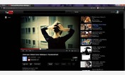
The contrast between the the buttons and background is poor.
Watching videos is eye straining because of the white.
There's a bunch of crap on the main page. All you need is a search function.
I fix this.
First install FreeStyler to use this style.
If you already installed it, please, make sure this site is allowed to run JavaScript.But you can download Freestyler for other browsers and apply styles there!
Applies to:
youtube.com