
Related styles:
-
dropbox.com — display more files
Installs:Created: Apr 18, 2012Last Updated: Jan 30, 2014 -
 Created: Jan 28, 2016Last Updated: Jan 28, 2016
 -
 Created: Oct 04, 2016Last Updated: Oct 04, 2016
 -
Created: Jun 06, 2012Last Updated: Jun 07, 2012
-
Created: Jun 09, 2015Last Updated: Jun 09, 2015
-
 Created: Mar 21, 2010Last Updated: Apr 23, 2010
 -
 Created: May 19, 2010Last Updated: Jun 08, 2012
 -
 Created: May 24, 2016Last Updated: Dec 20, 2016
 -
 Created: Sep 18, 2010Last Updated: Apr 26, 2017

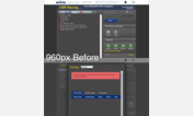
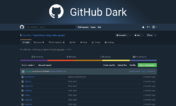
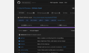
GitHub/Lighthouse — Improve code font readability
Description:
Sorry, but default code fonts that GitHub uses, 'Courier' and 'Bitstream Vera Sans Mono' (gist), just don't do it for me. In Windows the default font for gist even shows up without antialiasing (smoothing)! 'Consolas' is a far nicer font and supports antialiasing in Windows, so it's default now :)
Check out the before and after screenshots - it's subtle, but for extended reading it's miles better.
Make sure you have http://freestyler.ws/style/9337/userstyles-org-downsize-screenshots-to-fit-window installed to properly see the differences in the screenshots below!
First install FreeStyler to use this style.
If you already installed it, please, make sure this site is allowed to run JavaScript.But you can download Freestyler for other browsers and apply styles there!
Applies to:
github.com, gist.github.com, lighthouseapp.com, userstyles.org