
Related styles:
-
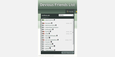
Devious Friends List
Installs:Created: Nov 10, 2013Last Updated: Nov 11, 2013 -
 Created: Mar 12, 2012Last Updated: Mar 13, 2012
 -
 Created: Mar 12, 2012Last Updated: Mar 13, 2012
 -
 Created: Mar 12, 2012Last Updated: Mar 13, 2012
 -
 Created: Jun 17, 2016Last Updated: Mar 27, 2017
 -
 Created: Apr 19, 2016Last Updated: Mar 17, 2017
 -
 Created: Feb 18, 2009Last Updated: Nov 01, 2016
 -
 Created: Mar 08, 2013Last Updated: Feb 25, 2017
 -
 Created: Apr 23, 2016Last Updated: Nov 05, 2016

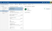
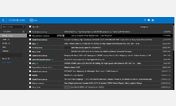
Outlook.com Tidy
Description:
Reduced margins and padding around folders and messages means you can see more on-screen at a time. The footer and right column are also hidden, so you won't get ads or other things distracting you while you work.
PS. to get even more space to view messages when using a preview pane on the right, go into Display Settings and disable the message preview line to get 2 lines per mail instead of 3.
More info
- Minimized the left-indent on the email conversation container so HTML emails can now use the full width of the preview pane.
V4.0.2 updated in 2016-07-17
- Now works with the 2016 re-skin of Outlook Mail. Keeping the old CSS too because there is a transition period for some users.
First install FreeStyler to use this style.
If you already installed it, please, make sure this site is allowed to run JavaScript.But you can download Freestyler for other browsers and apply styles there!
Applies to:
live.com