Related styles:
-
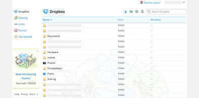
dropbox.com — display more files
Installs:Created: Apr 18, 2012Last Updated: Jan 30, 2014 -
Created: Apr 22, 2010Last Updated: May 06, 2010
-
Created: Jun 09, 2015Last Updated: Jun 09, 2015
-
Created: Jun 06, 2012Last Updated: Jun 07, 2012
-
Created: Oct 04, 2016Last Updated: Oct 04, 2016
-
Created: Jan 28, 2016Last Updated: Jan 28, 2016
-
Created: Mar 21, 2010Last Updated: Apr 23, 2010
-
Created: Aug 28, 2008Last Updated: Aug 29, 2008


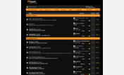

ebuyer.com — tighter product lists
Description:
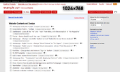
The current style (2012-06-08) of the ebuyer.com site means that the product listings take up quite a lot of space, making it harder to compare products and forcing you to scroll more than you need to.
Images are out of date, but it has a similar effect — more things visible vertically!
First install FreeStyler to use this style.
If you already installed it, please, make sure this site is allowed to run JavaScript.But you can download Freestyler for other browsers and apply styles there!
Applies to:
ebuyer.com