Related styles:
-
Google (search results) - widen results
Installs:Created: Jun 07, 2007Last Updated: Dec 04, 2008 -
Created: Jun 02, 2007Last Updated: Dec 18, 2008
-
Created: Mar 18, 2008Last Updated: Mar 19, 2008
-
Created: Jul 30, 2007Last Updated: Jul 31, 2007
-
Created: Jun 07, 2007Last Updated: Jun 23, 2007
-
Created: Jun 17, 2007Last Updated: Mar 09, 2008
-
Created: Jun 04, 2007Last Updated: Sep 20, 2008
-
Created: Jul 30, 2007Last Updated: Jul 31, 2007
-
Created: Jun 13, 2007Last Updated: Dec 03, 2007





USBman@userstyles deleted this style
Try Google (search results) - widen results instead of this deleted style.
See more styles for Google
Google Reader - Post Tweaks
Description:
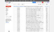
1) occupying the full width of the window, on any resolution screen, while the navigation menu is visible (rather than a fixed, narrow width). This replicates the full width posts seen when the navigation menu is hidden.
2) removing the silly "go" button at the end of every headline. This seems redundant, as clicking on the headline itself does the very same thing.
3) Justifies the text in posts. I find the readability to be improved this way.
4) Adds padding to images, so the text doesn't cram right up next to images. I find this also improves readability.
If you like this, you might also enjoy another one of my styles: stlye 8983 .
(03-08-08 - updated, and added image padding)
(03-18-08 - added padding to left of timestamp)
(07-23-08 - cleaned up code a bit & made the width modifications apply to both a visible and collapsed subscription listing column)
First install FreeStyler to use this style.
If you already installed it, please, make sure this site is allowed to run JavaScript.But you can download Freestyler for other browsers and apply styles there!
Applies to:
http://www.google.com/reader, https://www.google.com/reader