Related styles:
-
Lights Out (White Pages be Gone!)
Installs:Created: Oct 27, 2009Last Updated: Mar 19, 2010 -
Created: Aug 01, 2007Last Updated: Feb 02, 2011
-
Created: May 30, 2010Last Updated: Sep 13, 2015
-
Created: Aug 05, 2012Last Updated: Aug 06, 2012
-
Created: May 24, 2009Last Updated: Jun 13, 2012
-
Created: Feb 17, 2012Last Updated: Feb 18, 2012
-
Created: May 01, 2011Last Updated: May 11, 2015
-
Created: Sep 01, 2014Last Updated: Jan 18, 2017
-
Created: Aug 09, 2013Last Updated: Aug 10, 2013


Diddle@userstyles deleted this style
Try Lights Out (White Pages be Gone!) instead of this deleted style.
See other styles
Fok! Frontpage - Site cleanup
Description:
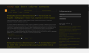
It removes:
- Banner on top of articles and the space that is reserved for them
- The news category
- The TRUE icon from the navbar
- The text 'Reacties' to save vertical space
It changes:
- The font and size of the article title
- The color of the article will be slightly darker and have a dotted border on top
- Headlines in the trackers on the left are shown on 1 line, even if they're slightly too wide
- The location of the 'Getoond: xx reacties. Toon alle reacties' text to the bar that also holds page navigation
Notes:
- You should check their CSS, you'll be in for a good laugh. It's the crappiest, most static, most unreadable ever. xD
First install FreeStyler to use this style.
If you already installed it, please, make sure this site is allowed to run JavaScript.But you can download Freestyler for other browsers and apply styles there!
Applies to:
frontpage.fok.nl