Related styles:
-
Created: Sep 27, 2012Last Updated: Jan 10, 2016
-
Created: Jun 14, 2010Last Updated: May 07, 2016
-
Created: Jan 06, 2016Last Updated: Jan 06, 2016
-
Created: Jun 25, 2014Last Updated: Jun 30, 2014
-
Created: Feb 28, 2013Last Updated: Nov 19, 2016
-
Created: Dec 02, 2011Last Updated: Feb 01, 2013
-
Created: May 14, 2010Last Updated: May 15, 2010
-
Created: Jun 22, 2016Last Updated: Jun 22, 2016
-
Created: Feb 01, 2011Last Updated: Feb 01, 2011







voltaek@userstyles deleted this style because of "Engadget completely redesigned their site, so this style no longer works as of the start of 2016"
Try Reddit Advice Animals Subreddit Annoyances Removal instead of this deleted style.
See more styles for Engadget
Engadget - Minus Garbage Plus Width (Dec 2012)
Description:
January 2016 - It looks like Engadget has had a full redesign and this no longer works. As I don't really read Engadget anymore, I will not be updating this style.
***************************************
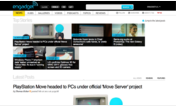
This is a cleanup of Engadget.com
Keep in mind that since their new design is 'fluid', their site will normally resize as the browser window does. This style was designed for use on a desktop or laptop screen that's at least 1000px wide, with the browser maximized. This shouldn't be an issue, even for those on netbooks.
See the "More Info" section for the list of changes this style makes to the site and updates to the style.
I also wrote a similar userstyle for Anandtech.com:
http://freestyler.ws/style/26371/anandtech-minus-garbage-plus-width-may-2016
Let me know if you find anything I missed, or if you have any suggestions.
More info
* entire right column
* ads
* features carousel (recent features header bar)
* meta stuff from the blogroll (fb, twitter, etc [still on story pages])
* entire footer
Changed:
* widened everything to fill the now-hidden right column's space
* centered images, titles, etc
Not Changed:
* text sizes
* fonts
* pictures/logos
* background/text colors
UPDATES:
12/05/12- COMPLETE RE-WRITE - Due to Engadget's redesign, I threw everything out and started over. Let me know if you see any errors, I don't browse the site as much as I used to.
=========
12/24/11- Cleanup of minor changes to the site, hid 'tip us' tab, fixed hubs stuff, centered new GDGT boxes, hid some ad boxes, stretch gallery and topics page titles
7/23/11- Tweaked blogroll image centering.
6/10/11- Inspected site for any changes, minor changes
3/22/11- Ad removal (flash sprint ad), ctia banner removal, some spacing fixes, OPTION to hide Tweet button added (in the code, not using Stylish's option thing since it kills updating the style), hid 'alt.engadget' header (again), podcast page header centering
1/9/11- Video centering for more vids
11/4/10- Killed "AOL Original" logo, again.
10/22/10- Now that disqus commenting is on all subdomains, I could finally clear out the old code and make the one line of code change needed to support the new system. Removed commenting stats numbers' size tweak since it seems they fixed their error.
9/15/10- Fixed centering of daily recap graph (again) should be pretty resilient now to any minor changes they make to its coding. Centered liveblog images.
9/13/10- Made commenting stats numbers (says "5 comments 20 likes received" by commenting box) normal size (Engadget's error)
8/31/10- Centered a few scattered article images and made sure all article images will be centered now
8/27/10- Centered live stream of Engadget Show
8/22/10- Stretched search box to use up blank space. Removed 'blog comments powered by disqus' link while loading comments.
8/19/10- Update for Engadget Classic's new DISQUS commenting system. Since old system is still on Alt, HD, and Mobile, those stay properly stretched like they already were
First install FreeStyler to use this style.
If you already installed it, please, make sure this site is allowed to run JavaScript.But you can download Freestyler for other browsers and apply styles there!
Applies to:
engadget.com