Related styles:
-
Lights Out (White Pages be Gone!)
Installs:Created: Oct 27, 2009Last Updated: Mar 19, 2010 -
Created: Aug 01, 2007Last Updated: Feb 02, 2011
-
Created: May 30, 2010Last Updated: Sep 13, 2015
-
Created: Aug 05, 2012Last Updated: Aug 06, 2012
-
Created: May 24, 2009Last Updated: Jun 13, 2012
-
Created: Feb 17, 2012Last Updated: Feb 18, 2012
-
Created: May 01, 2011Last Updated: May 11, 2015
-
Created: Sep 01, 2014Last Updated: Jan 18, 2017
-
Created: Aug 09, 2013Last Updated: Aug 10, 2013


Diddle@userstyles deleted this style
Try Lights Out (White Pages be Gone!) instead of this deleted style.
See other styles
iBood - Dark Grey Redesign
Description:
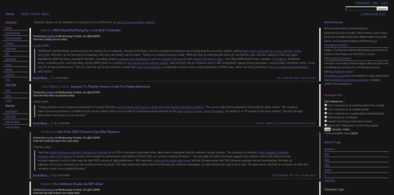
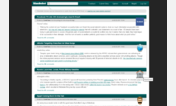
Since a new product is posted at 0:00, it's dark outside and around you and then a 99% white page in your face sucks. This style removes the usual whiteness of the site and replaces it with a nice grey design, while keeping all of the functionality.
Unfortunately, there are one or two buttons on the site I can't remove with CSS because they're embedded in javascript too deep. Also, at the moment, my script replaces buttons with the Dutch version of them. If there's enough demand, I can easily translate them to English for all sites or to specific languages for every subsite.
You can see more images of the end-result here:
Main page: http://img527.imageshack.us/my.php?image=iboodgreyvj1.png
Site FAQ: http://img257.imageshack.us/my.php?image=iboodgrey2ql9.png
Forum: http://img467.imageshack.us/my.php?image=iboodforumay9.png
== Update (Site update of April 17th, 20
First install FreeStyler to use this style.
If you already installed it, please, make sure this site is allowed to run JavaScript.But you can download Freestyler for other browsers and apply styles there!
Applies to:
http://www.ibood.com/site/nl/forum, http://www.ibood.com/site/eu/forum, http://www.ibood.com/site/de/forum, http://www.ibood.com/site/uk/forum... More »